COTEC / Universidade Nova
Translating doctorate-level risk theory into a B2B SaaS engine

Client
COTEC / Universidade Nova
Year
2021
Project type
B2B
Industry
Software, Data Management, Project Management
Tools
Figma, Zeplin, Slack, Loom
Who's Cotec?
Cotec is a private non-profit association established in 2003 with the support of the President and Prime Minister of Portugal, dedicated to fostering innovation and competitiveness in Portuguese companies. The association's mission is to enhance the competitiveness of Portuguese companies through the promotion of innovation and the dissemination of knowledge.
The organization collaborates with its members and institutions in the National Innovation System to achieve its goals through various initiatives. The project undertaken by COTEC is challenging due to the involvement of multiple stakeholders with different objectives and the impact of economic, social, educational, and cultural factors specific to Portugal.
The challenge
Cotec, a leader in Portuguese innovation, partnered with a Doctorate student from Universidade NOVA to digitize a complex risk-assessment framework. The goal was to replace an outdated, non-scalable Excel system with a robust B2B platform that could predict the viability of projects using Monte Carlo simulations and Analytic Hierarchy Process (AHP) logic.
The impact
From abstract to actionable
Translated 4 years of academic research and intricate mathematical formulas (Beta distributions, Utility functions) into a clear, 4-module user journey.
The spreadsheet killer
Eliminated the friction of a fragmented spreadsheet system, moving toward a centralized, scalable digital platform for Portuguese companies to secure public and private funding.
Future-proof documentation
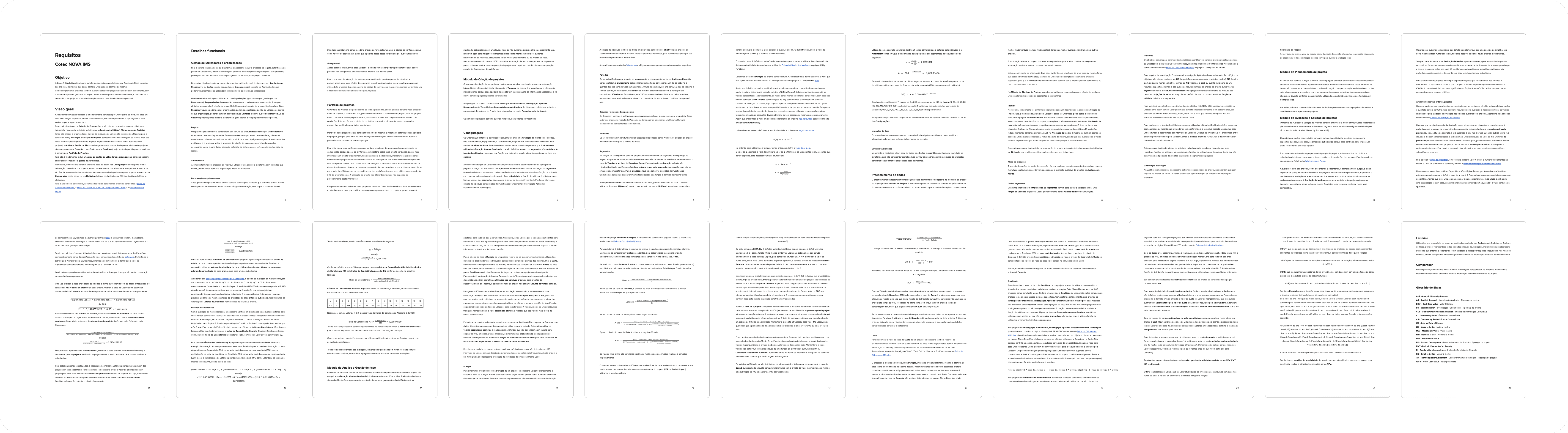
Authored a comprehensive 21-page Functional Requirements document that served as the project's source of truth, allowing the team to resume development after a funding-related pause without losing a single design decision.
Strategic risk visualization
Designed a "Scenario Stress-Testing" environment where users could adjust variables (costs, human resources, timelines) to lower a project's risk profile in real-time.
My role
As the Product Designer, I led the discovery workshops, translated complex Excel logic into wireframes, and built the Styleguide. My primary mission was to act as the "translator" between the academic complexity of the thesis and the practical needs of the B2B user.
The strategy
Designing for high stakes
In this project, a 1% error in data entry could lead to a million-euro miscalculation. My strategy was built on three pillars:
Logic deconstruction
Breaking down formulas like U(X)=a+bX^{c} into simple, step-by-step user inputs.
Progressive complexity
Using a tiered dashboard to show big picture status (Project Portfolio) before diving into granular risk calculations.
Resilient systems
Building a styleguide capable of surviving a multi-month project pause by focusing on clear documentation and functional requirements.
From math to interface
Deconstructing the doctorate thesis
The project was rooted in an intricate doctorate thesis featuring dozens of complex formulas, specifically the Analytic Hierarchy Process (AHP) and Monte Carlo simulations. My first task was a "translation phase", breaking down several weeks of workshops and messy Excel support files into a clear set of functional requirements.
Solving the "Utility Function" paradox
The core of the risk analysis relied on the Utility Function (U(X)=a+bX^{c}), a formula that determines how tolerant a project is to specific risks.
The UX challenge
Users cannot be expected to input variables for "a, b, and c" manually.
The solution (calibration via interview)
I designed a questionnaire flow that acted as a calibrator. Instead of asking for math, the UI asked the user to choose between two scenarios of project evolution.
The result
By finding the "Point of Indifference" through user answers, the system automatically calculated the Xindifferent value and plotted the utility curve.
Simulating the future: the Monte Carlo dashboard
To help companies secure funding, they needed to prove their project's viability over 1, 2, 3, or 4-year projections.
Monte Carlo integration
I designed the UI to handle 1,000 random samples for each task's duration and cost.
Visualizing uncertainty
Rather than just showing a single success number, I utilized Cumulative Distribution Function (CDF) Histograms. This allowed users to see the probability of their project finishing within a specific budget or timeframe.
The stress-test environment
The platform wasn't just a calculator; it was a simulator.
Variable play
I created an environment where users could play around with variables, such as adjusting human resources or equipment costs, to see an immediate impact on the project's risk score.
Goal-oriented design
This enabled users to adjust their project plans specifically to lower risk, creating a data-backed justification for their investment applications.
Most designers shy away from math. I leaned into it. By turning a BETA.INV function into a series of simple pessimistic vs. optimistic inputs, I transformed a doctoral thesis into a tool that any project manager could use to save their budget.

Documentation as a design tool
Navigating the funding gap
Midway through the project, the doctorate research hit a common academic hurdle: a multi-month pause while waiting for funding. For most teams, a 3-month gap leads to knowledge loss, decisions are forgotten, and momentum is lost.
The solution: A 21-page functional source of truth
To ensure the project could be reanimated instantly, I took the lead on drafting the Comprehensive Functional Requirements Document. This wasn't just a technical spec; it was a UX map that bridged the gap between the Doctorate thesis and the final code.
Logic preservation
I documented every mathematical dependency, from how Resources and Equipment affect hourly costs to the exact parameters of the Monte Carlo simulation (Mean, Variance, Alpha, Beta)
Module interdependency
I mapped out the four core modules (Project Creation, Planning, Merit Evaluation, and Risk Analysis) to show how data flows from a simple task list into a high-level risk histogram.
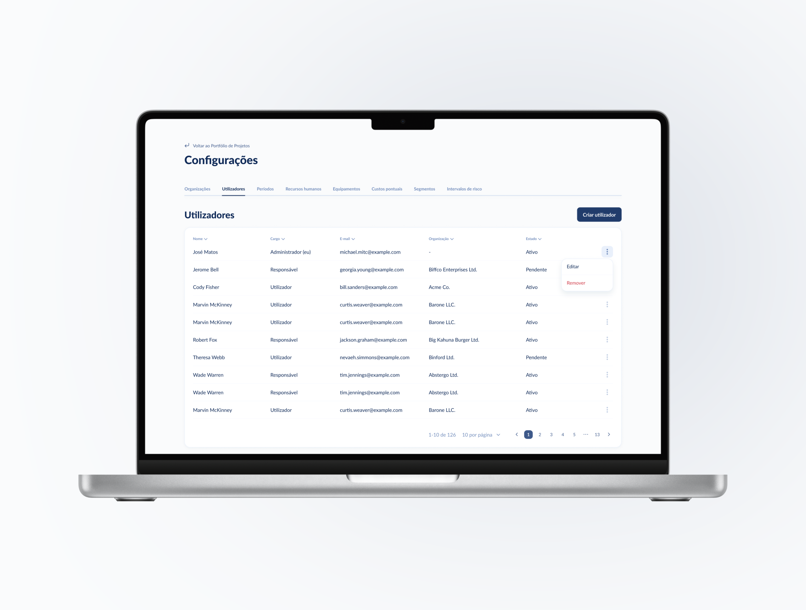
Permission Mapping
I defined a granular access system (Admin, Responsible, Manager) to ensure data integrity across different organizations.
Asynchronous leadership
Because the stakeholders (Cotec and the University) had extremely limited availability, I shifted the design process to be fully asynchronous.
Video walkthroughs
I used recorded Loom sessions to explain wireflow logic, allowing the "Brain" (the student) and the "Business" (COTEC) to provide feedback on their own schedules.
Validation loops
This documentation allowed the external development team to start background architecture work and provide accurate estimates even while the UI was still being polished.
Permission Mapping
I defined a granular access system (Admin, Responsible, Manager) to ensure data integrity across different organizations.
When the funding finally arrived, we didn't have a re-learning phase. We opened the Requirements Document, reviewed the wireframes, and were back at full velocity within 48 hours.
Visual strategy & final delivery
Designing for focus: the rationale behind dark mode
To ensure the project could be reanimated instantly, I took the lead on drafting the Comprehensive Functional Requirements Document. This wasn't just a technical spec; it was a UX map that bridged the gap between the Doctorate thesis and the final code.
The dashboard effect
The goal was to create a "Control Room" feel. Dark backgrounds reduce eye strain during long sessions of data entry and allow the colorful risk indicators (Red/Yellow/Green) to pop.
Psychological shifting
By changing the visual environment, we signaled to the user: "You are now in the decision-making engine." This distinction helped separate administrative tasks from high-level strategic analysis.
The architecture of clarity
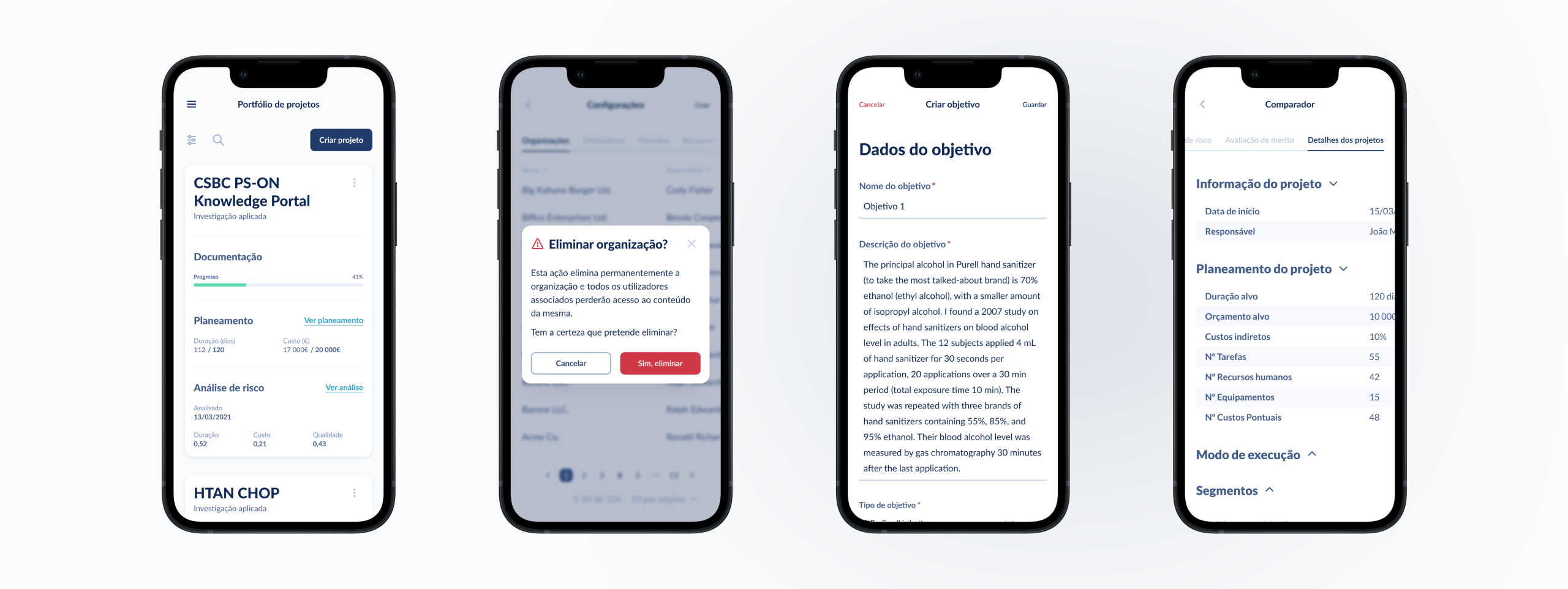
The platform was organized into four interdependent modules to prevent information overload:
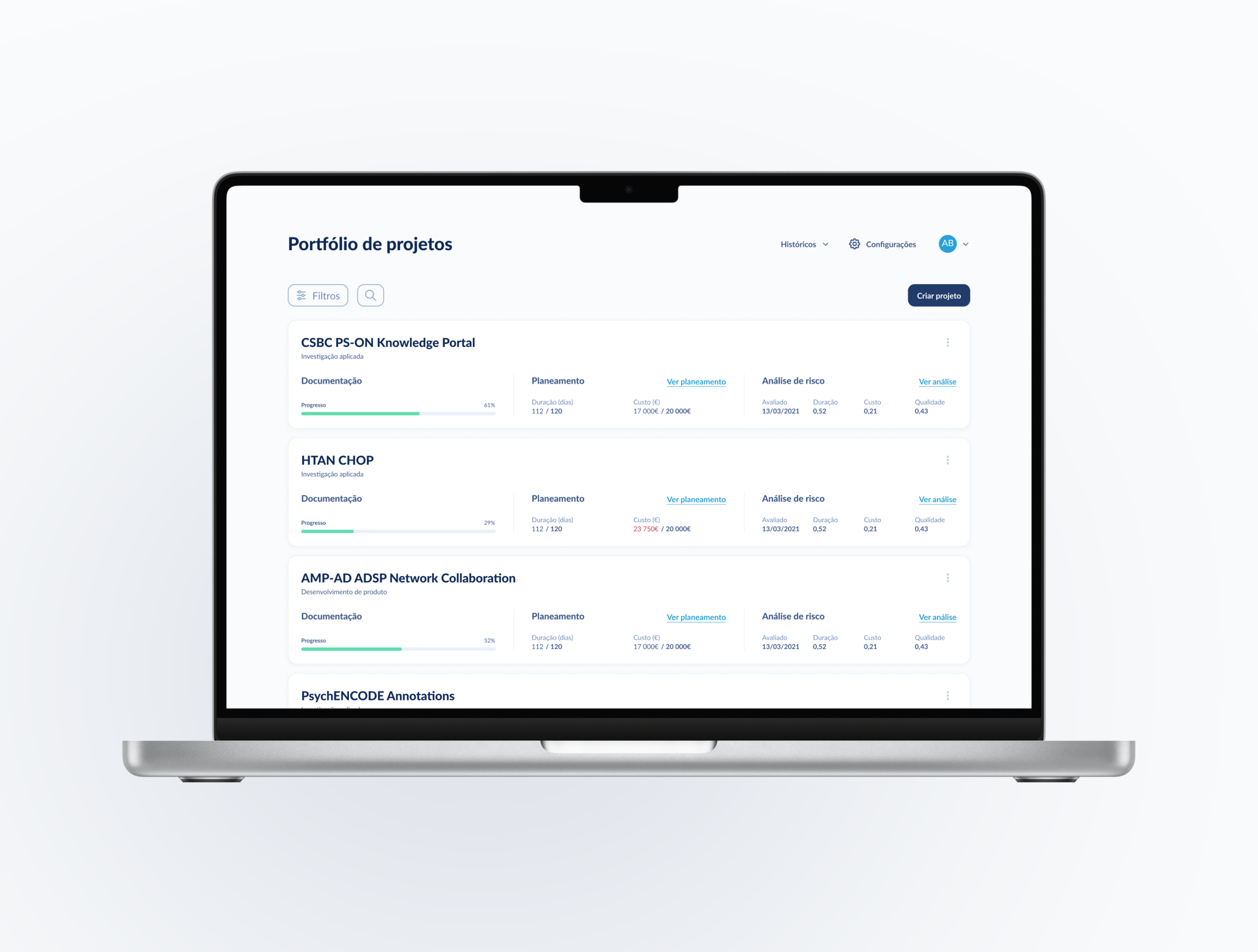
Project Portfolio
A central hub providing a health check on all active projects, including completion percentages and the date of the last risk analysis.
Planning & successions
A Gantt-style interface where users assign Resources and Equipment to tasks, directly feeding the cost and duration formulas.
Merit evaluation (AHP)
A comparative module that uses Pairwise Comparisons (scaled 1–9) to mathematically rank projects against one another.
Risk calculation
The final output, where Monte Carlo simulations generate 1,000 random samples to predict the probability of a project hitting its targets.
The result: a decision-making powerhouse
The final product was more than a digitizing of a thesis; it was a tool for national competitiveness.
Viability evidence
Companies now have a stress-test environment to play with variables. Adjusting budgets or timelines to decrease risk and create a data-backed justification for funding.
Scaling innovation
By providing a structured way to evaluate Fundamental vs. Applied Research, Cotec can now objectively identify which projects have the highest merit for the Portuguese economy.
Final thought
In this project, I proved that Product Design isn't just about making things easy to use: it's about making complex, million-euro decisions easy to trust.
By bridging the gap between academic theory and B2B utility, we built a platform that turns 'Risk' into a manageable variable.