Nimbus, Zscaler's Design System
Unifying 27 enterprise platforms through design systems

Client
Zscaler
Year
2025-2026
Project type
B2B Product
Industry
Cybersecurity
Tools
Figma, Slack, Loom, Storybook, Zeroheight, Jira
Who's Zscaler?
Zscaler is a global leader in cloud-based cybersecurity, helping enterprises secure, monitor and optimise how their people and systems connect to the internet. In practice, that means giving IT and security teams deep visibility into network behaviour — and making sense of enormous amounts of data in real time.
For designers, that context matters. Zscaler's products aren't marketing pages or onboarding flows. They're complex, data-dense dashboards used by technical professionals under pressure, where clarity isn't a nice-to-have: it's operational. With a product portfolio spanning 27 platforms and a UX team of 20, the design challenge was less about making things beautiful and more about making a sprawling system coherent.
The challenge
By the time our team joined as an extension, the cracks were visible everywhere.
Twenty designers working across 27 different platforms had naturally developed 27 different interpretations of the same components. A button here didn't behave like a button there. A chart in one product told a different visual story than the same chart in another. Over time, this inconsistency had compounded: in some cases, audits revealed four or five variations of the same component existing in parallel, each doing essentially the same job.
On the engineering side, the cost was just as real. Without a shared component library, developers were rebuilding the same elements repeatedly, platform by platform. Every new acquisition the company made, and Zscaler was growing through M&A, meant another integration effort from scratch, with no common visual or technical language to plug into.
Layered on top of this were the human challenges. The design team went through a leadership change mid-project, which shifted priorities and ways of working. Engineering changed their delivery methodology twice. And with a six-hour timezone difference between teams, most collaboration had to happen asynchronously, through recorded Figma walkthroughs, Slack threads and carefully written comments, leaving very little room for real-time alignment.
The process
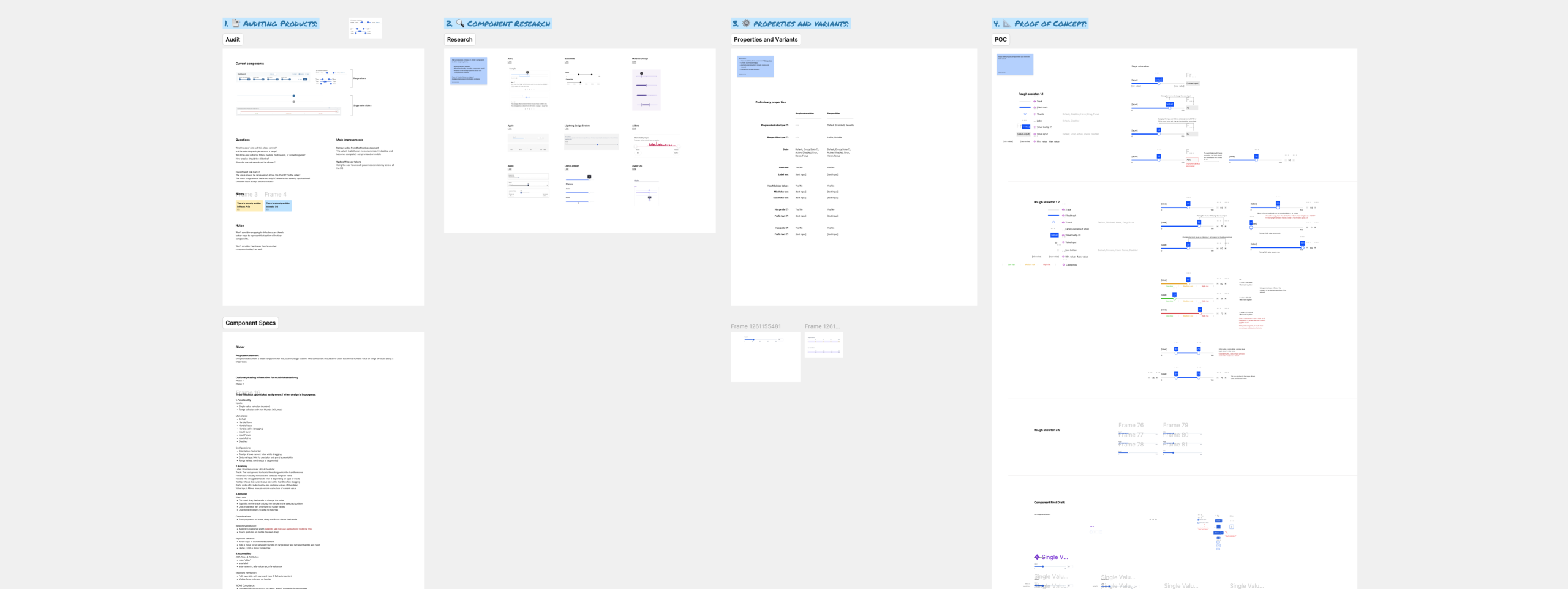
Start with the audit
Every component began the same way: with an honest look at what already existed. In many cases, that meant finding four or five variations of the same element across different platforms, each slightly different, each justified at the time it was created, and each adding to the accumulated inconsistency the system was trying to resolve.
Beyond the visual audit, I spoke directly with the major consumers of each component — the designers using them day to day — to understand the real usage patterns, edge cases and unmet needs that documentation never captures.
Look outward before deciding
Before proposing any solution, I studied how other mature design systems approached the same problems. Not to copy, but to understand the range of valid answers and make an informed, defensible decision. This was especially important for the DataViz components, where charting conventions carry meaning and deviation from them creates cognitive load for technical users.
Structure before UI
Only after the audit, the conversations and the research would I move into architecture, component structure, behaviours, interaction states, responsiveness, how sub-components would be reused across the system. The UI came last, applied on top of already established variables. This sequencing was deliberate: it prevented visual decisions from driving structural ones, which is one of the most common and costly mistakes in design system work.
One component I'm particularly proud of is the button group pattern. The challenge was making it consistent across a global product used in multiple languages. Rather than anchoring direction to RTL or LTR conventions — which would have required maintaining separate variants — I built it around leading and trailing concepts, making the pattern inherently direction-agnostic and adaptable to any locale.
Validate constantly, ship nothing in isolation
Every structural decision was validated with the broader design team and with engineering before moving forward. Given the six-hour timezone gap, this meant building an async-first collaboration culture, Figma recordings, written annotations, structured Slack threads, so that nothing was left to guesswork when the other side of the world woke up.
The handoff framework
Midway through the project, engineering flagged a recurring problem: the JIRA tickets and Figma handoffs they were receiving varied too much across designers. They had the visuals, but not the full picture, leaving gaps that created rework, delays and frustration on both sides.
I took this on. I designed a documentation framework that standardised how every designer on the team delivered components to engineering. Every ticket would now cover:
Responsiveness
How components and charts adapt to different container sizes
Behaviours
Hover states, minimap interactions, filtering logic
Variants
Single bar, grouped bar, stacked bar, and every relevant state
Styling
Light and dark mode specifications
Accessibility
Contrast, keyboard navigation, focus states
Localization
How components handle different locale settings
Screen reader behaviours
For assistive technology compliance
The framework eliminated the guesswork. Engineering had everything they needed, in the same structure, from every designer on the team regardless of who had built the component.
The impact
A unified system at scale
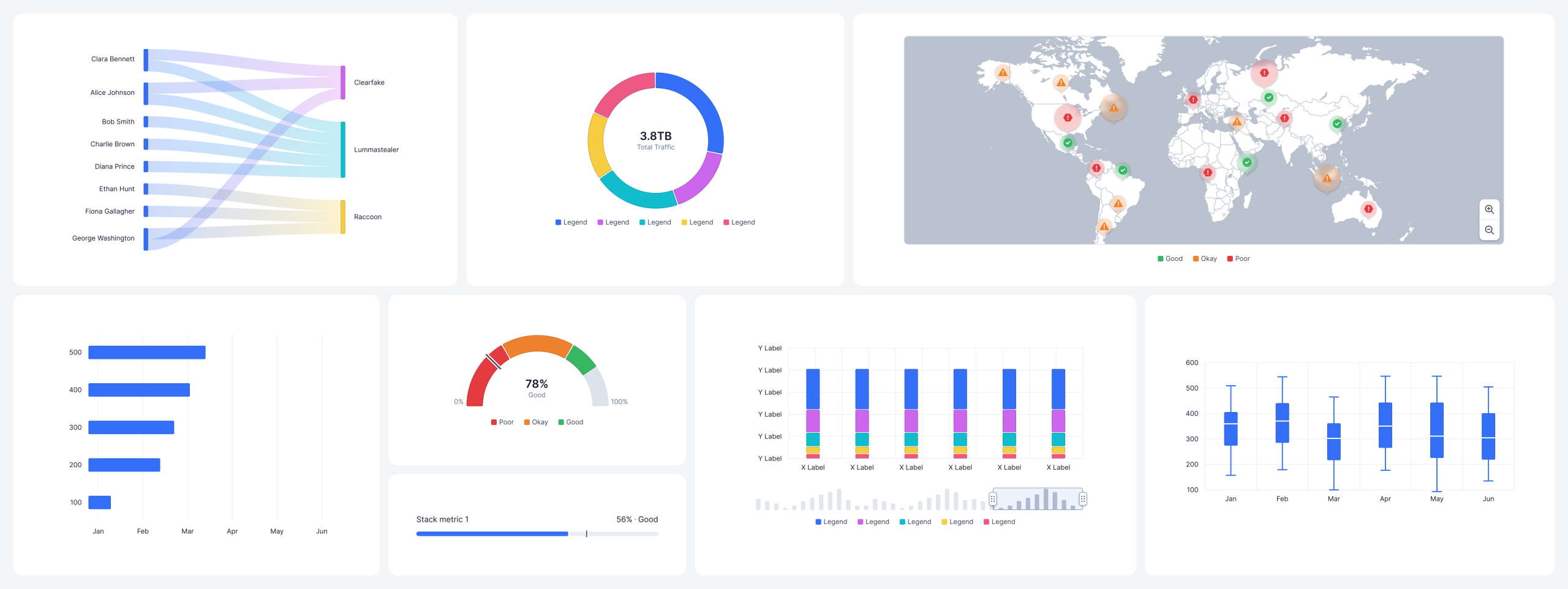
Over the course of the engagement, the team delivered 30+ components and 10+ patterns, consolidated across 27 platforms that had previously operated with their own interpretations of the same elements. For a UX team of 20 designers, this meant a shared language: one source of truth replacing years of accumulated divergence.
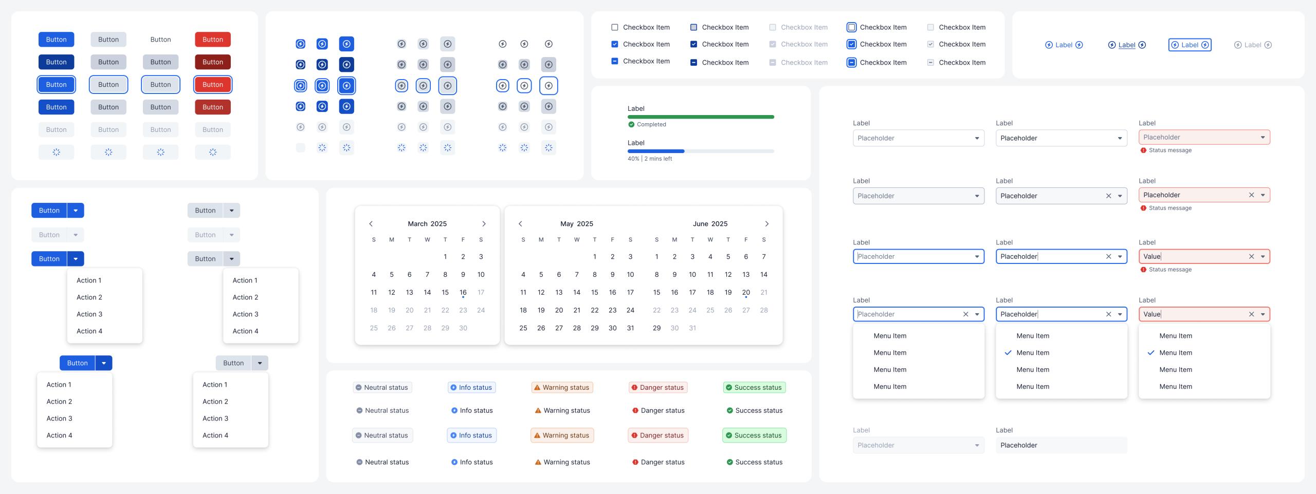
A DataViz library built to last
The data visualisation initiative produced 14 chart components, each systematised with reusable sub-components and backed by a solid engineering library. What started as a solo effort with audits, architecture, visual direction, became a scalable foundation that other designers could build on without re-litigating decisions already made.
M&A, accelerated
One of the quieter but more significant outcomes was the impact on Zscaler's acquisition pipeline. With a coherent, documented system in place, integrating products from newly acquired companies became a matter of replacing existing components and extending the system where needed, rather than rebuilding from the ground up each time. Consistency had a business case, and the system delivered it.
Engineering, unblocked
The handoff framework eliminated one of the most persistent sources of friction on the project. By standardising how every designer documented and delivered components, covering responsiveness, behaviours, variants, accessibility, localisation and screen reader support, engineering received everything they needed in a predictable, consistent format. No more guesswork. No more back-and-forth to fill gaps that should never have existed.
Knowledge, transferred
Two new designers were onboarded during the project and absorbed into a functioning system with clear processes and documented patterns. The work didn't just serve the current team: it built capacity for the next one.